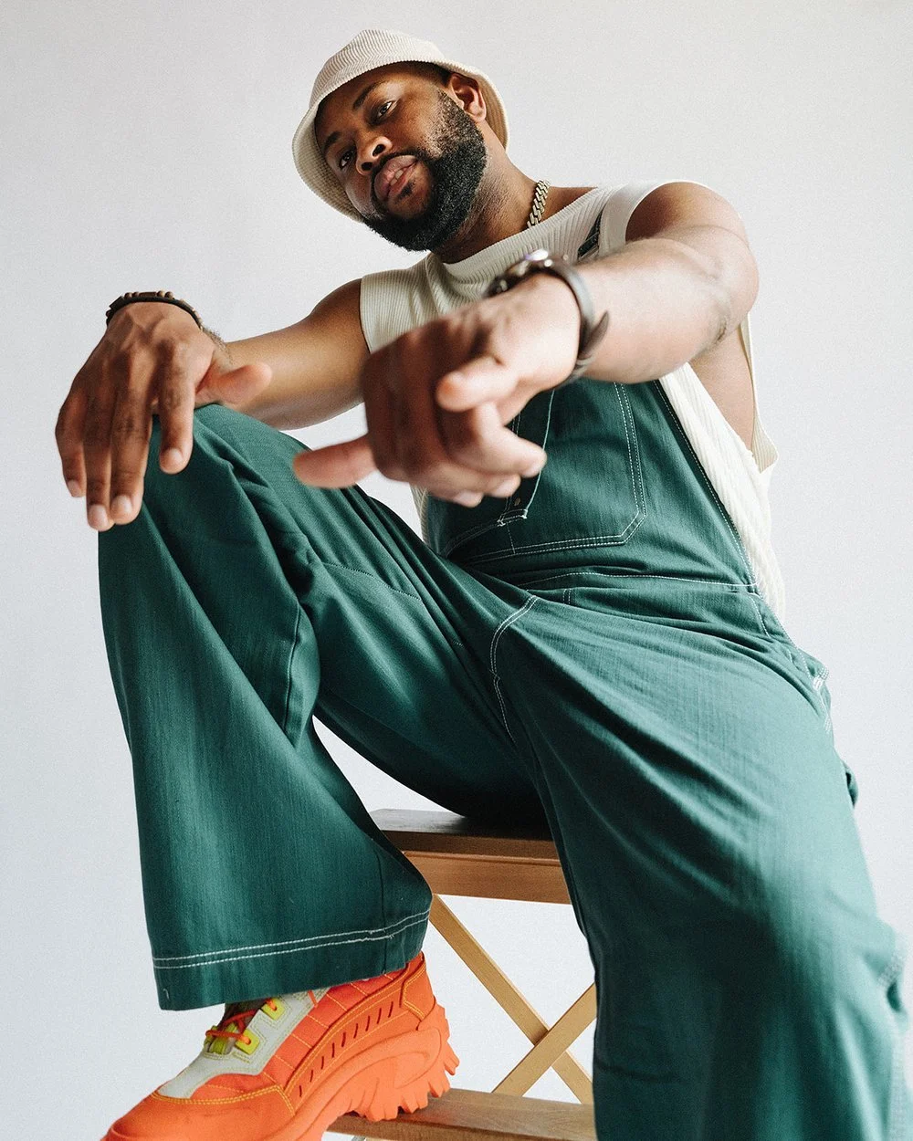
“Could Be Tonight”
Client: Hulvey
Creative Direction // Album Cover + Packaging // Photography // Graphic Design // Merch Design // Logo + Branding // Video & Visual Identity
Team: Graphic Designer, Kevin Hackett // Photographer, Quality Lenz // Painter, Daniel Hubbarde // Videographer, Artimio Black // Producer, Ray Spears
Overview
Could Be Tonight was rooted in Matthew 24, an exploration of our time here on earth, what is to come, and what it means to live as people of faith within the Church of God.
My responsibility was to take what we read in Scripture, combined with the lyricism, production, emotion, and overall sound of the record, and translate it into a visual language.
One of the central images from Matthew 25 became a blueprint for the entire record: “two men walking in a field one taken and the other left.”
That idea became a foundation for the visual world of Could Be Tonight. Rather than creating visuals for individual songs in isolation, the goal was to build a complete visual identity that could communicate the weight, urgency, beauty, and mystery of the entire record.
The listener should be able to look at the artwork and begin to understand what the album sounds and feels like before pressing play.
Creative Direction
I developed the overarching visual direction and branding system alongside Kevin Hackett, guiding how the music and themes of the album translated into imagery, design, physical packaging, merchandise, photography, and motion.
The direction included:
• Establishing a unified concept across the album
• Translating the themes of Matthew 24 into a visual language
• Defining visual rules for typography, layout, color, texture, and imagery
• Creating continuity between physical, digital, and wearable formats
• Directing photography and visual treatments
• Developing the visual identity across the album campaign
• Collaborating with artists, designers, photographers, videographers, and producers
Album Cover + Packaging
The objective was to find an image and visual approach that could represent the entirety of the record.
The album cover needed to communicate the sound, emotion, themes, and spiritual weight of Could Be Tonight in a single visual. The listener should be able to see the cover and begin to hear the songs without pressing play.
We explored three distinct creative directions:
Photography + Mixed Media
A photographic approach incorporating additional design, texture, and mixed media elements to create a layered representation of the album.
Painting
A painted approach that continued the visual language established through the album's single artwork, allowing the world of the record to feel connected and progressively developed.
Church Architecture
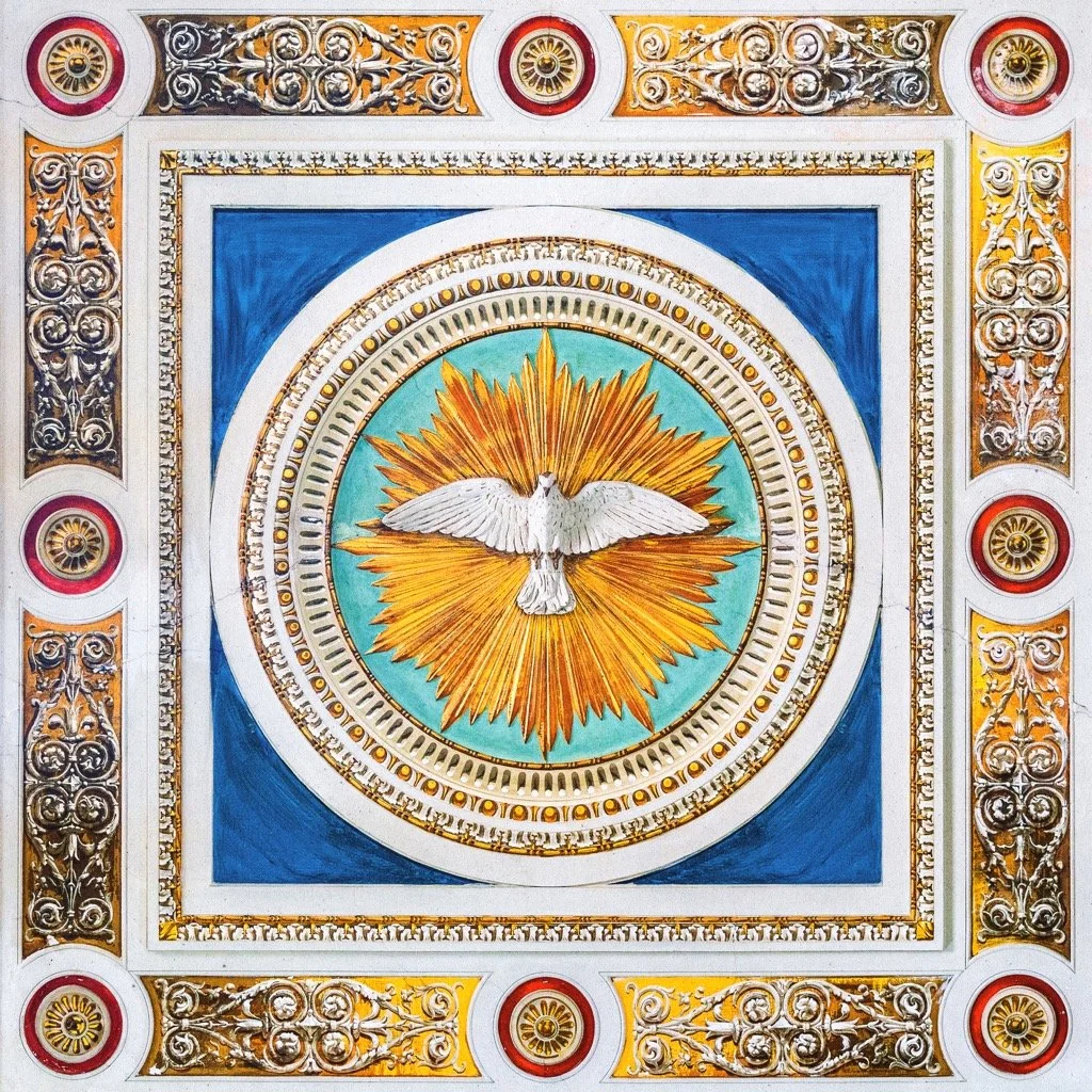
A perspective looking toward the ceiling of a church in Italy, creating a sense of scale, reverence, history, and the presence of God.
Each direction explored a different aspect of the record, but the goal remained the same: to create artwork that could hold the magnitude and weight of the album in visual form.
Photography
Photography extended beyond traditional press imagery.
From press photography and stills to album artwork, the photographic direction was developed around color, pose, environment, and emotion, each element intentionally connected to the overall message of the record.
The images needed to feel like they belonged to the same world as the music: intimate, cinematic, spiritual, and emotionally honest.
Photography became another way of translating the themes of the album without having to explain them literally.
Graphic Design
Graphic design became a further extension of the album's sound and visual language.
Typography, texture, color, mixed media, and composition were developed to create a system that could move across the entire campaign.
This included:
• Single artwork
• Additional album artwork
• Typography systems
• Textures and graphic treatments
• Mixed media compositions
• Promotional graphics
• Merchandise design
The design language was created to feel cohesive while still allowing each individual piece to have its own identity.
Merch Design
Merchandise was approached as an extension of the album's visual world rather than simply promotional product.
The goal was to create wearable pieces that carried the themes and imagery of Could Be Tonight beyond the music.
Designs were developed with longevity in mind, pieces that could function as merchandise while still feeling like a natural part of the larger visual identity.
Video + Visual Identity
I provided creative direction across multiple visual pieces connected to the album, helping establish consistency between the music, film, photography, and graphic language.
“Automatic” | Music Video + Trailer
Creative direction for the visual world surrounding “Automatic,” including the music video and trailer.
“DAVE” | Visualizer
Creative direction for the visualizer, extending the album's visual language into motion.
“Field of Flowers” | Short Film
Creative direction for Field of Flowers, using film, environment, pacing, and visual symbolism to further explore the spiritual and emotional themes surrounding the record.
These pieces were treated as parts of the same visual ecosystem rather than isolated videos.
Collaboration
Could Be Tonight was a collaborative creative process. I worked alongside a group of artists and creatives, each contributing their own discipline to the larger visual world.
Graphic Designer, Kevin Hackett
Collaborated on the overarching visual and branding system.
Photographer, Quality Lenz
Collaborated on photography and photographic execution.
Painter, Daniel Hubbarde
Contributed to the painted visual language explored throughout the project.
Videographer, Artimio Black
Collaborated on the execution of video and moving image content.
Producer, Ray Spears
Contributed to the musical production that informed the visual direction and helped establish the sonic world that the visuals were designed to represent.
Role
Creative Director
• Concept development & visual strategy
• Album artwork & packaging
• Photography direction
• Graphic design
• Merch design
• Logo & branding
• Video & visual identity
• Creative collaboration & oversight
• Visual advising across the album campaign
Outcome
The result was a visual ecosystem built around the central ideas of Could Be Tonight, faith, urgency, eternity, mortality, and what is to come.
The project brought together music, photography, graphic design, painting, film, packaging, and merchandise to create a world that could exist beyond the album itself.
The intention was simple: take what was being communicated through Scripture and music and give it a visual language.
Could Be Tonight became not just a collection of songs, but a complete creative world, one designed to make the listener stop, look, and consider what it means to be here now, and what could come next.
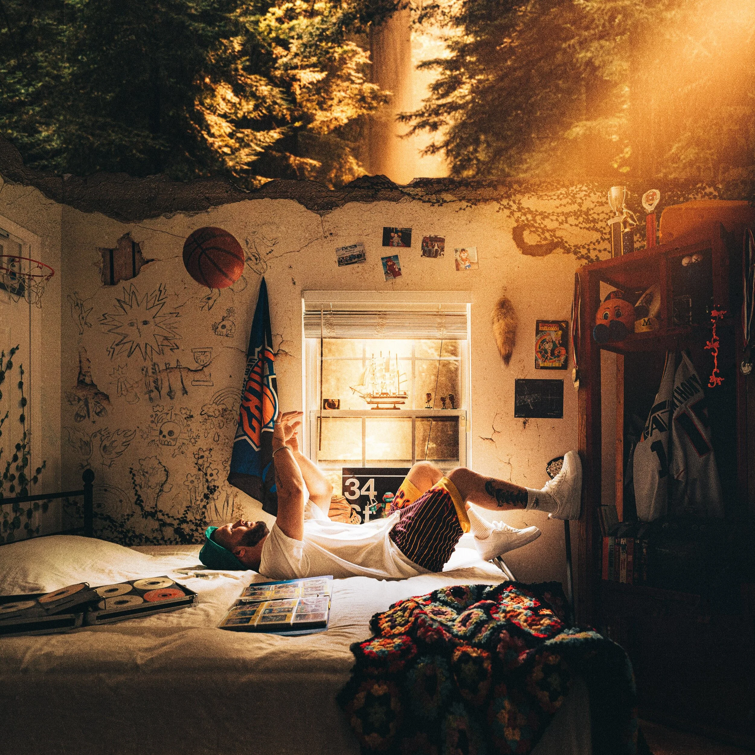
Photo shoot for “Neverland 2” album cover for ANDY MINEO // Art Direction: Kevin Hackett & myself // Creative Direction: Delgis Mustafa // Photography: myself // Design: Kevin Hackett
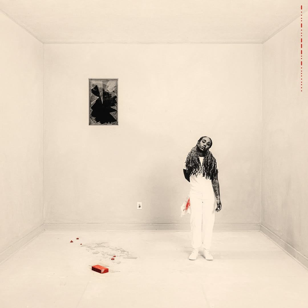
Album cover photography for Jackie Hill Perry’s album “Blameless” / Press photography / Creative direction + Design Kevin Hackett
“m us eum / Living Is Proof”
Client: Citizens
Creative Direction / Album Cover + Packaging // Photography // Graphic Design // Merch Design // Logo + Branding // Video & Visual Identity
Overview
m us eum (LP) and Living Is Proof (EP) are projects centered on memory, presence, and lived experience. The creative goal was to build a visual system that felt archival yet alive—something that honored the past while existing firmly in the present.
I led the creative direction across both releases, ensuring a cohesive visual language that could live across physical formats, motion, and merchandise while maintaining conceptual depth.
⸻
The Idea
The core concept treated the music as an exhibition of lived moments—songs as artifacts, emotions as preserved experiences. The visual language borrowed from museum and archival references, but stripped of institutional coldness, favoring humanity, imperfection, and intimacy.
The tension lived in the contrast:
curated, but personal
archived, but breathing
⸻
Creative Direction
I developed the overarching visual and branding system for both projects, guiding how the music translated into imagery, packaging, and motion.
Direction included:
• Establishing a unified concept across LP and EP releases
• Defining visual rules for typography, layout, and imagery
• Creating continuity between physical, digital, and wearable formats
⸻
Execution
Album Cover & Packaging
The album artwork and packaging were designed as tactile objects—meant to feel collected rather than consumed. Layouts referenced archival systems, spacing, and labeling, allowing restraint and negative space to carry meaning.
Photography
Photography focused on stillness and observation. Images were treated less as promotional portraits and more as documentation—capturing moments that felt quietly significant.
Graphic Design
Graphic systems were minimal and modular, allowing the identity to flex across formats while maintaining consistency. Typography and layout functioned as structural elements rather than decoration.
Logo & Branding
Branding elements were subtle and intentional—designed to support the narrative rather than dominate it. The identity acted as a framework that could hold evolving content without losing clarity.
Merch Design
Merchandise was approached as extension pieces—wearable artifacts tied to the album’s themes. Designs favored longevity and meaning over trend-driven graphics.
Video
Motion content expanded the concept through pacing and atmosphere, emphasizing tone and texture over performance. Video functioned as another room in the exhibition rather than a standalone asset.
⸻
Role
Creative Director
• Concept development & visual strategy
• Album artwork & packaging direction
• Photography, video, and motion direction
• Graphic systems, logo, and brand identity
• Merchandise design & creative oversight
⸻
Outcome
The result was a cohesive creative ecosystem across two releases—where music, design, film, and physical product felt unified by a single conceptual thread. m us eum and Living Is Proof functioned not just as records, but as curated bodies of work meant to be experienced, revisited, and lived with.
“Baptized Imagination”
Client: Kings Kaleidoscope
Creative Direction // Album Cover // Photography // Video // Film Direction // Graphic Design // Merch Design Visual World Building
Overview
Baptized Imagination is a studio album rooted in faith, creativity, and renewal. The goal was to build a visual world that matched the album’s emotional depth—one that felt intimate, human, and spiritually expansive rather than polished or performative.
I led the full creative direction for the project, shaping how the album lived visually across artwork, photography, film, and physical merchandise.
⸻
The Idea
The creative concept centered on imagination as a sacred space—a place of rebirth, honesty, and vulnerability. The visual language needed to feel raw but intentional, expressive but restrained, allowing emotion and narrative to lead rather than spectacle.
Every creative decision was filtered through this question:
Does this feel truthful to the album’s spirit?
⸻
Creative Direction
Developed the overarching visual thesis and guided the project from concept through execution, ensuring cohesion across all mediums.
Direction included:
• Defining the album’s visual tone and narrative framework
• Establishing a unified aesthetic across stills, motion, and design
• Translating abstract themes into tangible visuals
⸻
Execution
Album Artwork
The cover art was designed to feel lived-in and contemplative—prioritizing mood, texture, and symbolism over literal representation. Photography and layout were treated as extensions of the music rather than decorative elements.
Photography
Photography was directed to capture honesty and restraint. Natural light, minimal staging, and emotional presence were emphasized to maintain intimacy and authenticity.
Film & Video
Motion pieces expanded the album’s world through pacing, silence, and atmosphere. Direction focused on feeling rather than performance, allowing space for reflection and narrative breath.
Graphic & Merch Design
Merchandise extended the album’s identity beyond the music designed as wearable artifacts rather than promotional items. Each piece functioned as a physical expression of the album’s themes.
Photo shoot for “NEW HOLLYWOOD” Album Cover & “KIDS” single cover for WHATUPRG // Art Direction: Kevin Hackett, WHATUPRG, myself // Creative Direction: WHATUPRG, Kevin Hackett, Cassandra Jolie // Photography: myself // Design: Kevin Hackett
“I Can’t Find the Edges of You”
Client: Citizens
Creative Direction // Album Cover Design + Packaging // Photography // Film Director // Stop Motion // Merch Design & Visual World Building
Overview
I Can’t Find the Edges of You is a studio album rooted in intimacy, surrender, and emotional depth. The creative challenge was to visualize something intentionally undefined—to build a world where form, movement, and texture felt fluid rather than fixed.
I led the creative direction across visual, physical, and motion formats, shaping a cohesive language that mirrored the album’s sense of closeness and emotional immersion.
⸻
The Idea
The concept centered on limitlessness and vulnerability—the feeling of being unable to separate oneself from love, faith, or presence. Visually, this translated into softened boundaries, abstract movement, and imagery that resisted clarity or sharp definition.
The guiding principle was simple:
If it feels contained, it isn’t honest.
⸻
Creative Direction
I developed the overarching creative vision and directed how the album’s themes translated across mediums, ensuring emotional consistency from still imagery to motion and physical artifacts.
Direction included:
• Defining a fluid visual system without rigid edges
• Establishing tone through motion, texture, and pacing
• Translating emotional abstraction into tangible design
⸻
Execution
Album Cover & Packaging
The cover and packaging were designed as tactile expressions of intimacy—favoring softness, subtlety, and atmosphere. Layouts avoided hard structure, allowing imagery and space to feel unresolved and open-ended.
Photography
Photography was directed to feel close and immersive. Focus, framing, and light were used to dissolve distance, creating images that felt more sensed than observed.
Film Direction & Stop Motion
Film content expanded the album’s emotional language through movement and rhythm. Stop-motion techniques introduced fragility and imperfection, reinforcing the human presence within the work. Motion prioritized feeling over narrative clarity.
Merch Design
Merchandise extended the album’s visual identity into wearable form—designed as quiet statements rather than overt graphics. Each piece functioned as an extension of the album’s emotional atmosphere.
⸻
Role
Creative Director / Film Director
• Concept & visual strategy
• Album cover design & packaging
• Photography direction
• Film & stop-motion direction
• Merchandise design & creative oversight
⸻
Outcome
The project resulted in a cohesive visual and physical ecosystem that reflected the album’s emotional weight and openness. I Can’t Find the Edges of You lived beyond the music—existing as an immersive creative world that invited closeness, reflection, and repeated engagement.
Design, branding, logo design, photography & video for the Holiday family’s brand “In Ferias”
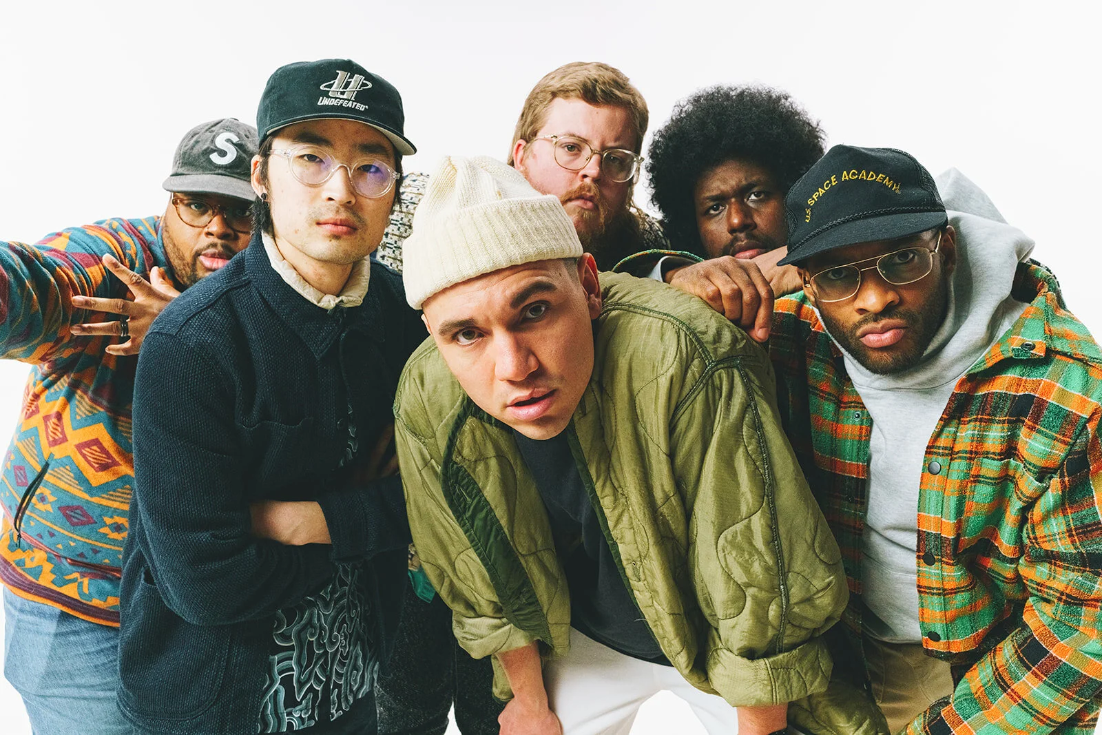
— PRESS PHOTOGRAPHY IN STUDIO ON LOCATION FOR KINGS KALEIDOSCOPE // SEATTLE WASHINGTON
Merch design / Creative Direction / Photography for Lecrae’s Fall Winter ‘23 Merch + Spring Summer ‘24 - Videography Artimio Black
Press photography for artist LIMOBLAZE // Cam Kirk Studios Atlanta Georgia
PHOTO SHOOT FOR TRIP LEE’S “THE EPILOUGE” & “THE END” ALBUM // Atlanta Georgia
COVER DESIGN : KEVIN HACKETT
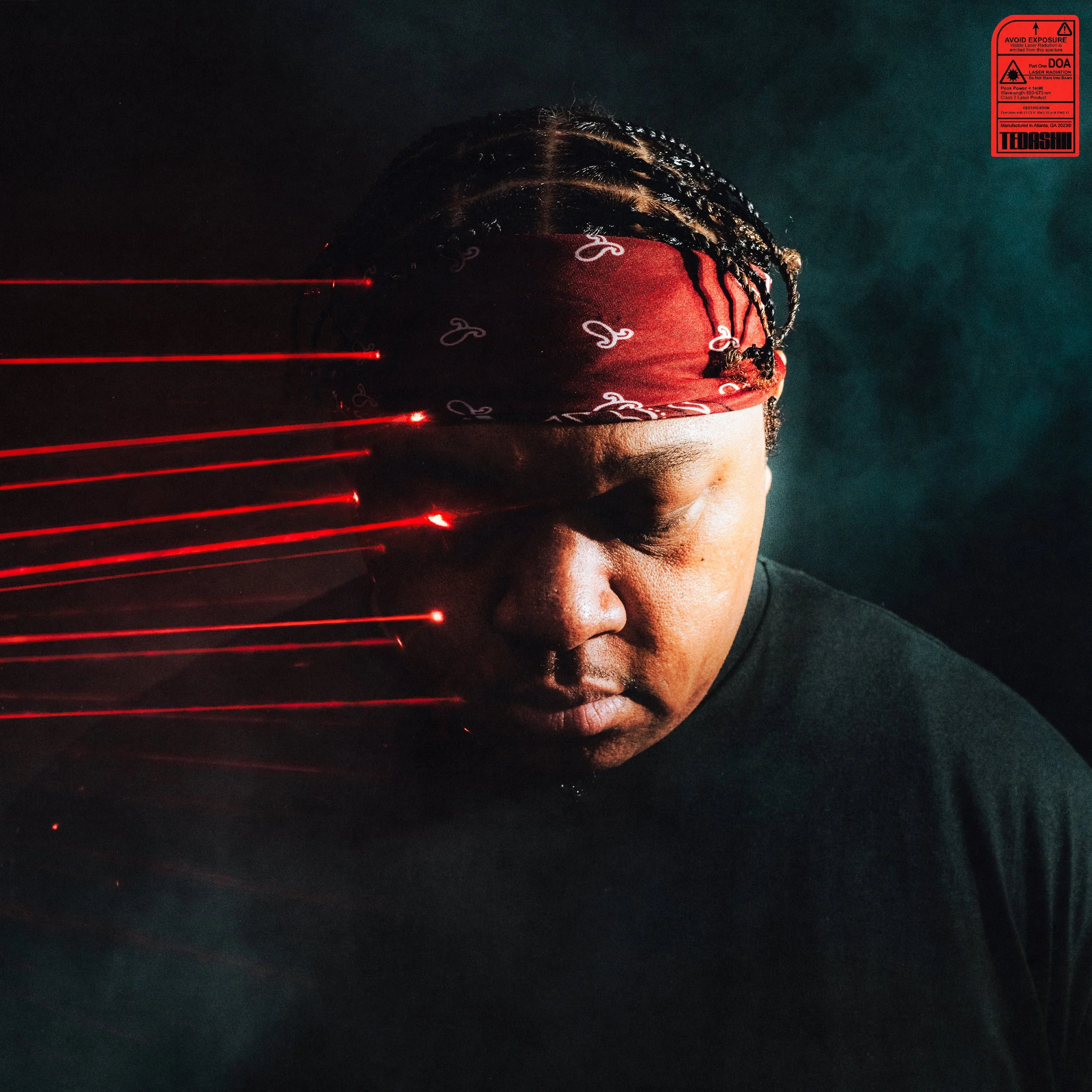
Photography for Tedashii’s “DOA” & “This Time Around 2” Album Cover / Press photography. Cover art by Kevin Hackett.
“The Joy of Being” LP
Client: Citizens
Creative Direction / Vinyl & Book Design/ Apparel Design / Photography / Editorial World building
Overview
The Joy of Being is an LP centered on presence, simplicity, and spiritual grounding. The creative challenge was to visualize joy without exaggeration—to communicate depth, calm, and gratitude through design that felt lived-in rather than performative.
I led the creative direction across album, book, apparel, and photography, building an editorial world that allowed the music’s themes to breathe across multiple formats.
⸻
The Idea
The concept treated joy as a state of being, not a moment of celebration. Visually, this meant restraint, softness, and clarity—allowing space, texture, and pacing to carry emotional weight.
The guiding belief was clear:
Joy doesn’t need to announce itself.
⸻
Creative Direction
I developed the overarching creative vision and editorial framework, ensuring cohesion across print, photography, and wearable expressions of the album.
Direction included:
• Establishing a calm, minimal visual language
• Translating spiritual and emotional themes into tactile form
• Creating continuity between music, book, and apparel
⸻
Execution
Album & Book Design
The album and accompanying book were designed as companion objects—meant to be held, revisited, and lived with. Layouts favored generous spacing, quiet typography, and intentional sequencing, allowing reflection to guide the experience.
Photography
Photography focused on stillness and honesty. Images were directed to feel unforced and present, capturing moments of calm rather than performance.
Apparel Design
Apparel functioned as an extension of the album’s ethos—minimal, wearable pieces designed to feel timeless and personal rather than promotional.
⸻
Role
Creative Director
• Concept & visual strategy
• Album and book design
• Photography direction
• Apparel design & creative oversight
⸻
Outcome
The Joy of Being became a cohesive creative ecosystem—where music, print, imagery, and apparel aligned under a single, quiet philosophy. The project invited listeners not just to hear the album, but to inhabit it.
— GRAPHIC DESIGN / TOUR PHOTOGRAPHY / LOOKBOOK / MOTION GRAPHICS / VIDEOGRAPHY FOR KINGS KALEIDOSCOPE’S “ZEAL” LP